Some time ago, I posted the cover art for the ebook editions of The Wheel of Time series by Robert Jordan. For the sake of comparison, here is the art for the US hardback editions. All of these covers were done by Darrell K. Sweet except for the last book, A Memory of Light, which was done by Michael Whelan.
Click each image to see a larger version.
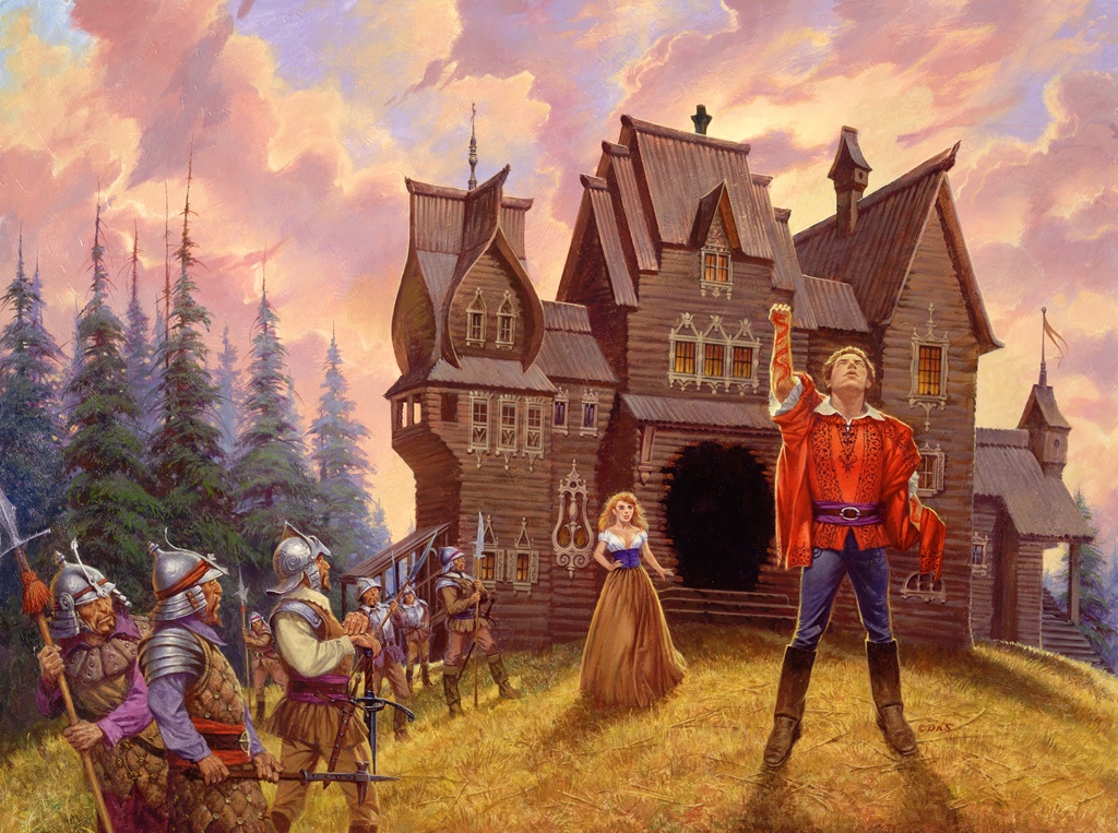
Prequel — New Spring cover art
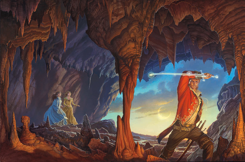
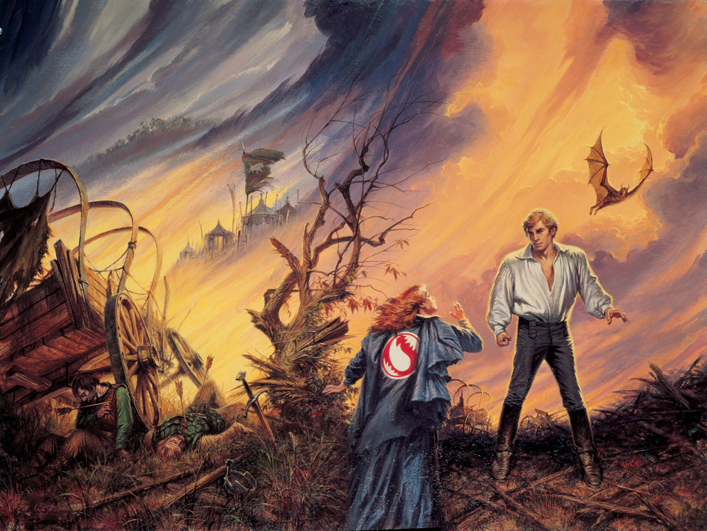
1. The Eye of the World outside cover art
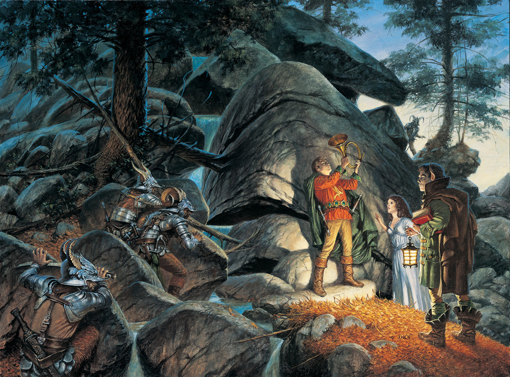
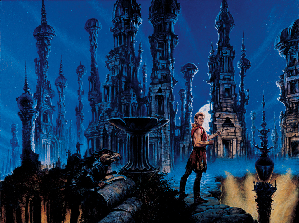
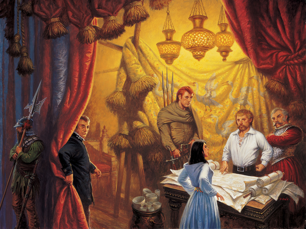
The Eye of the World inside front cover art
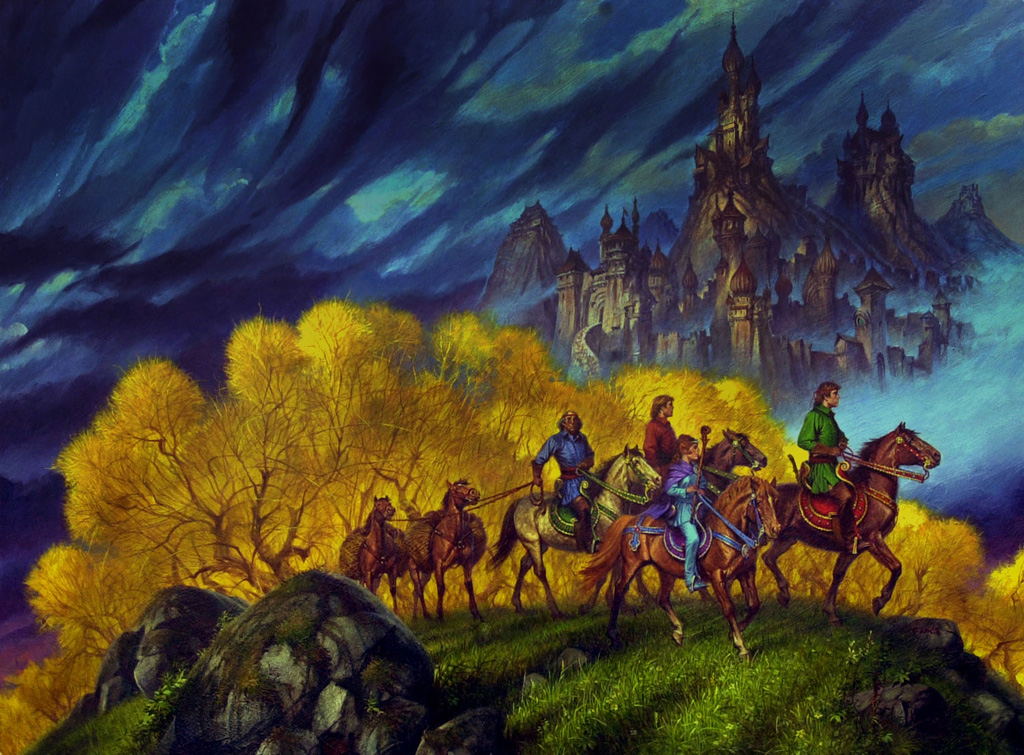
2. The Great Hunt cover art
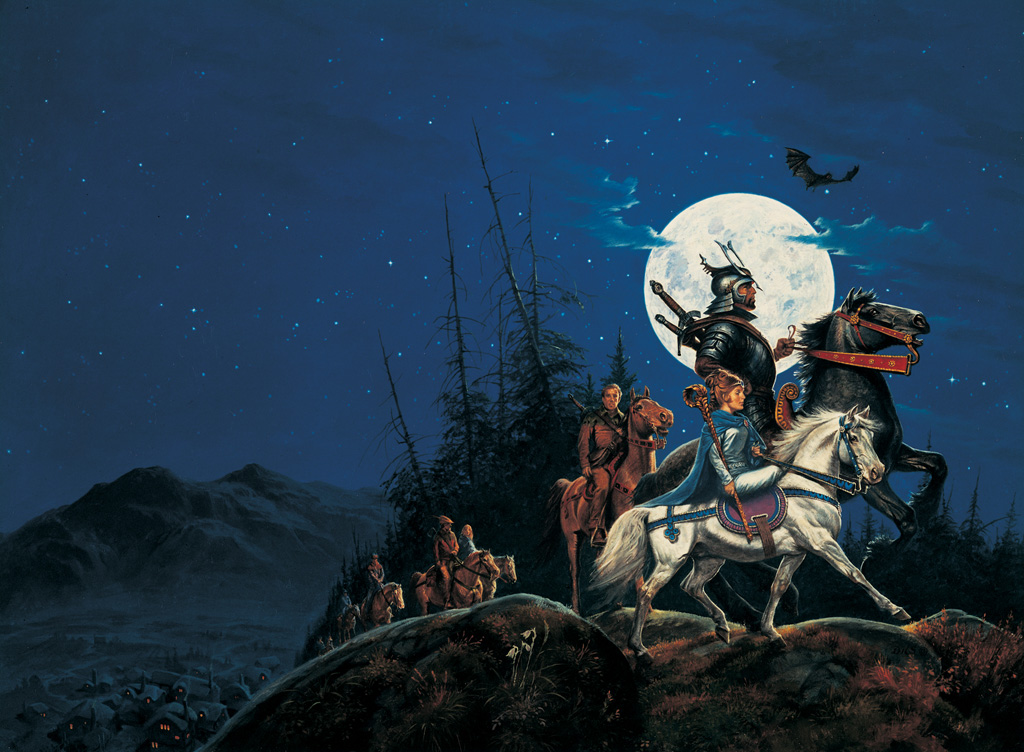
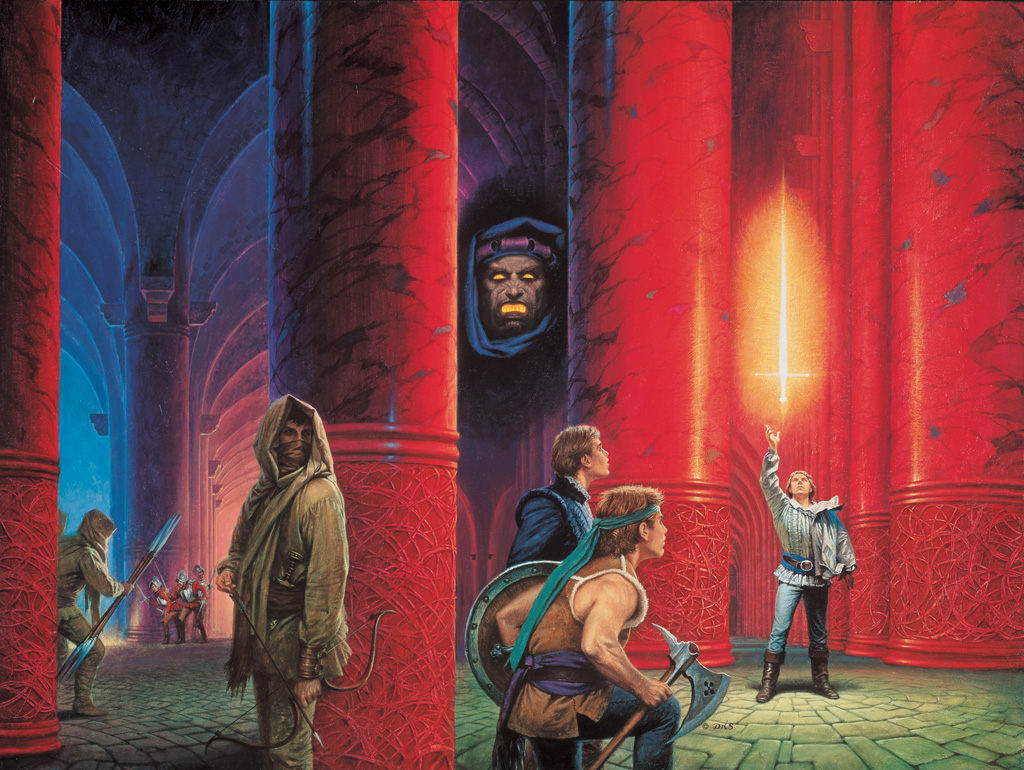
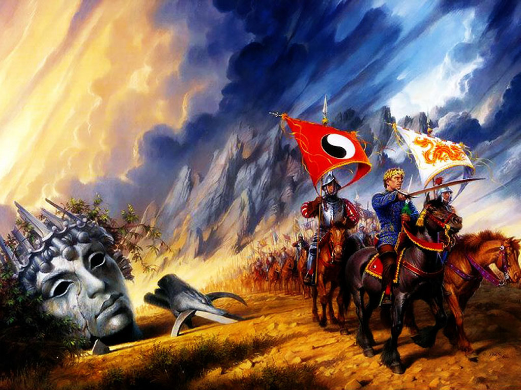
3. The Dragon Reborn cover art
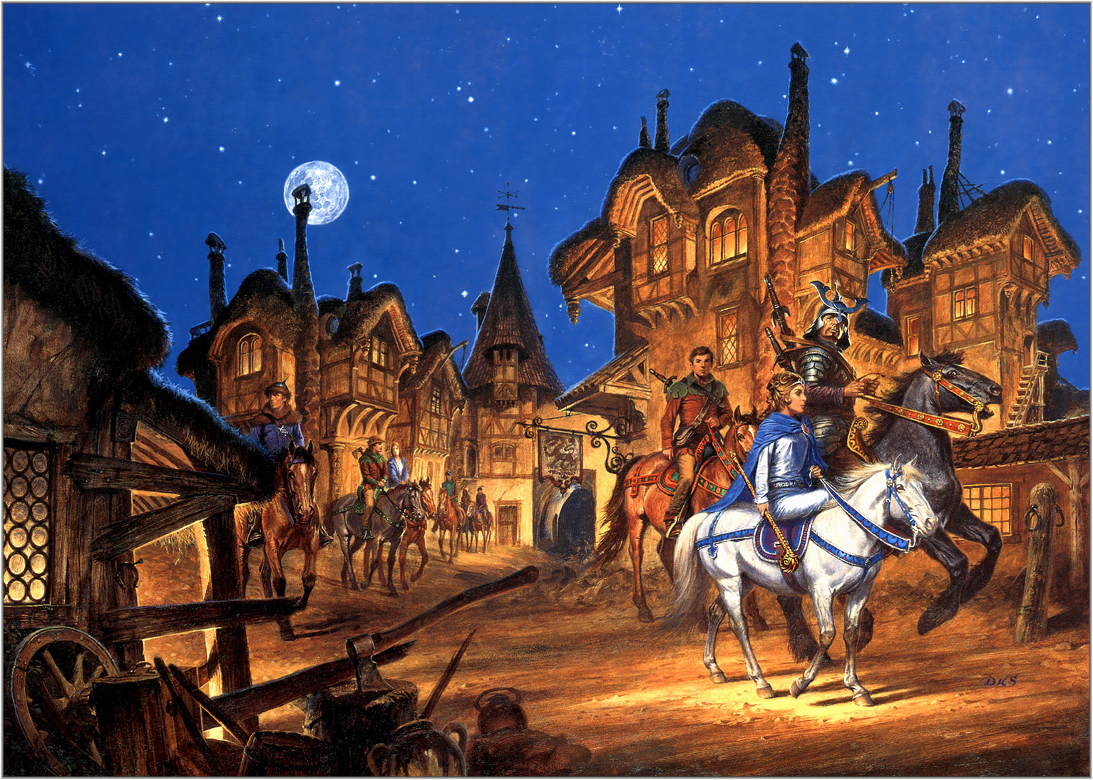
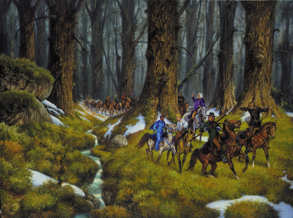
4. The Shadow Rising cover art
5. The Fires of Heaven cover art
6. Lord of Chaos cover art
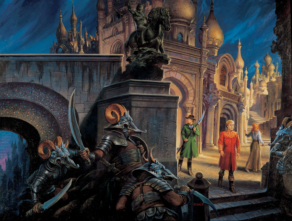
7. A Crown of Swords cover art
8. Path of Daggers cover art
9. Winter’s Heart cover art

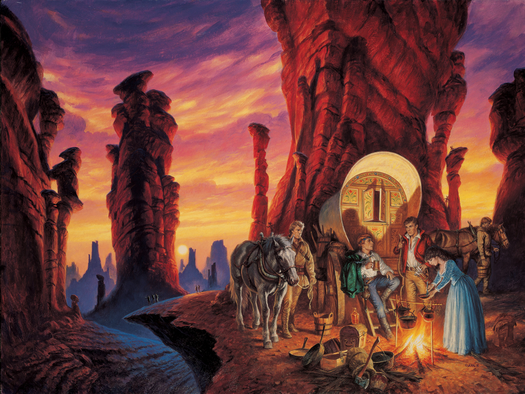
10. Crossroads of Twilight cover art
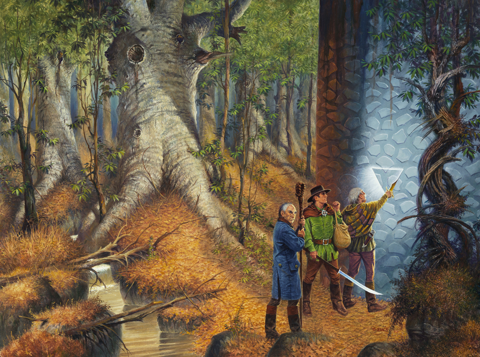
11. Knife of Dreams cover art
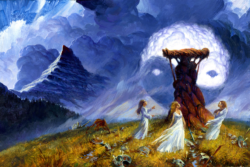
12. The Gathering Storm cover art
13. The Towers of Midnight cover art
14. A Memory of Light — Darrell K. Sweet unfinished concept art
Mr. Sweet passed away before finishing the cover.
A Memory of Light cover art — Michael Whelan